A new property management and realty company came to Sutter Group with a request to help them with their branding. The company is composed of two groups, P5 Realty and P5 Properties. They asked for the logo to make the P5 instantly identifiable, as it has personal meaning to the owners.
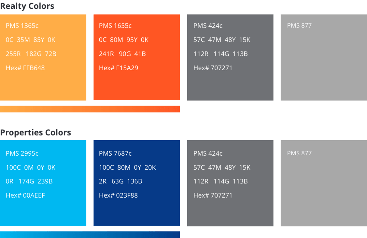
Sutter Group did an extensive market and design study and, through working with the client, we developed a brand with a mid-century modern feel. This brought a unique perspective to the realty business space. To differentiate the two sides of the business, we color-coded each – orange/red for the consumer side (P5 Realty) and light blue/dark blue for the commercial side (P5 Properties).

