Challenge
Health Management Associates came to Sutter Group with a request to brand a new program of theirs for addressing the opioid public health emergency. Specifically, they wanted a logo that could be identifiable from a distance and that would convey unity, diversity and care.
Solution
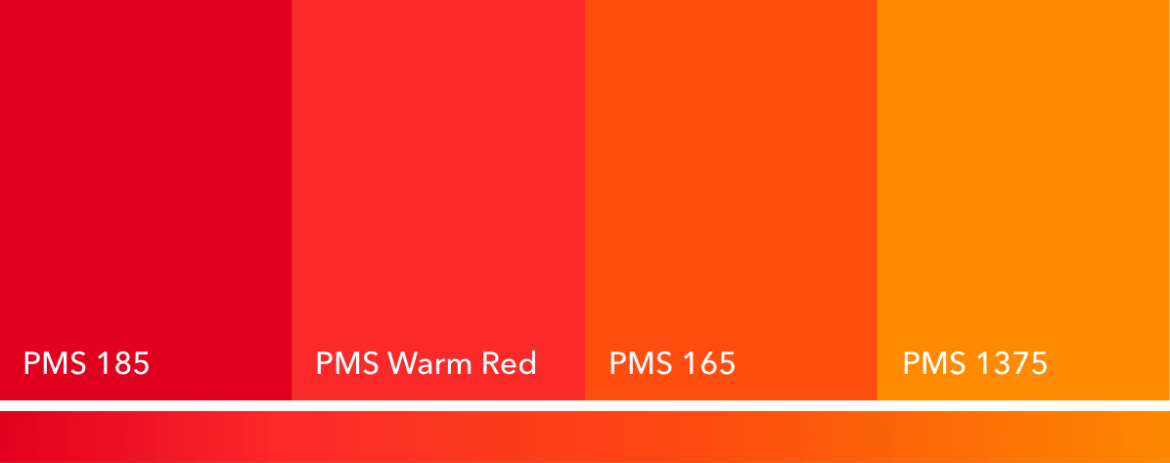
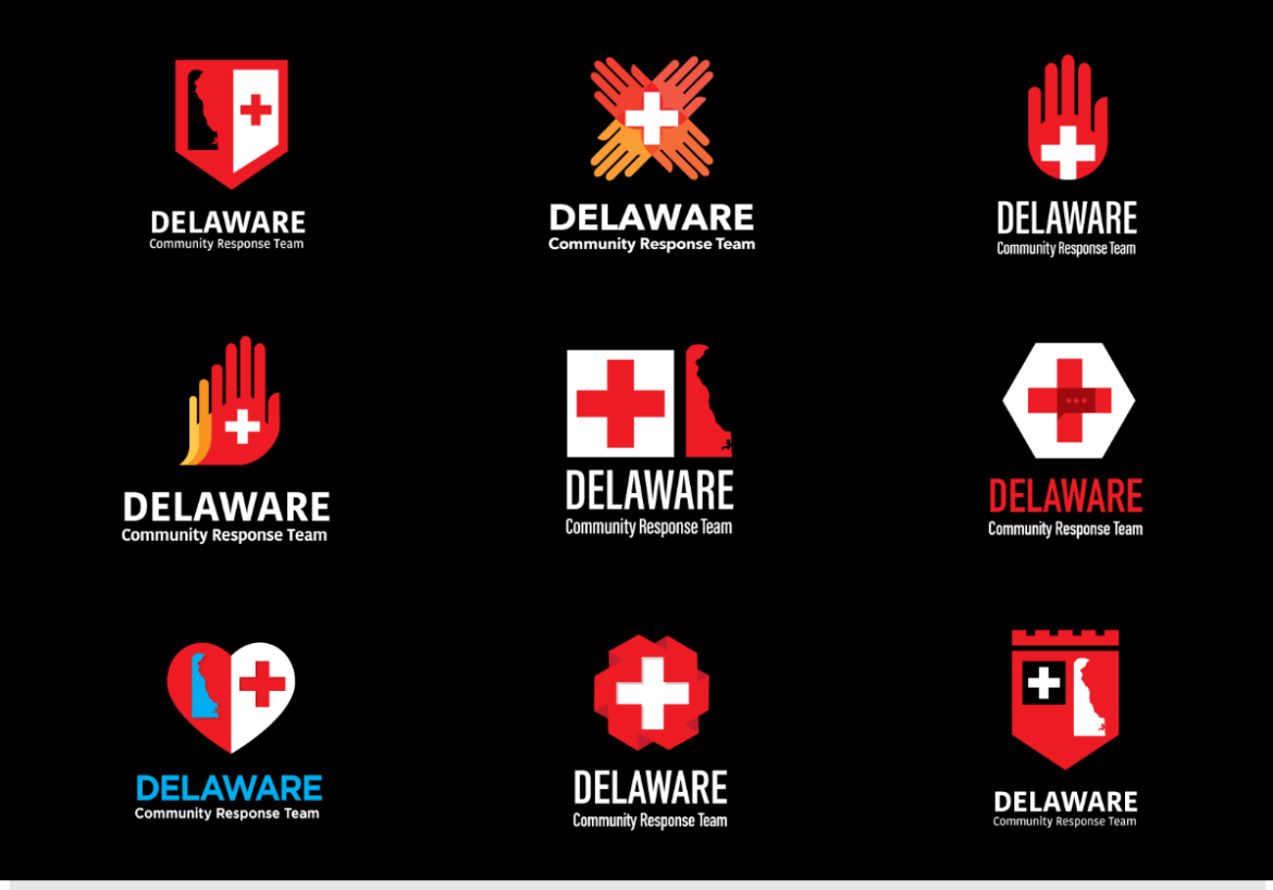
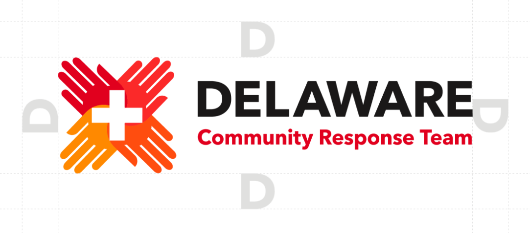
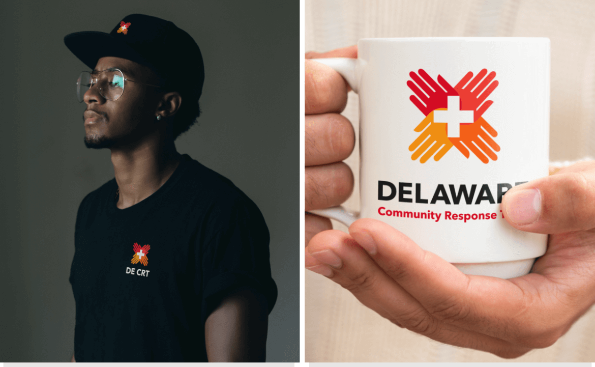
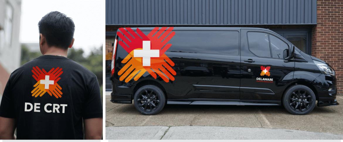
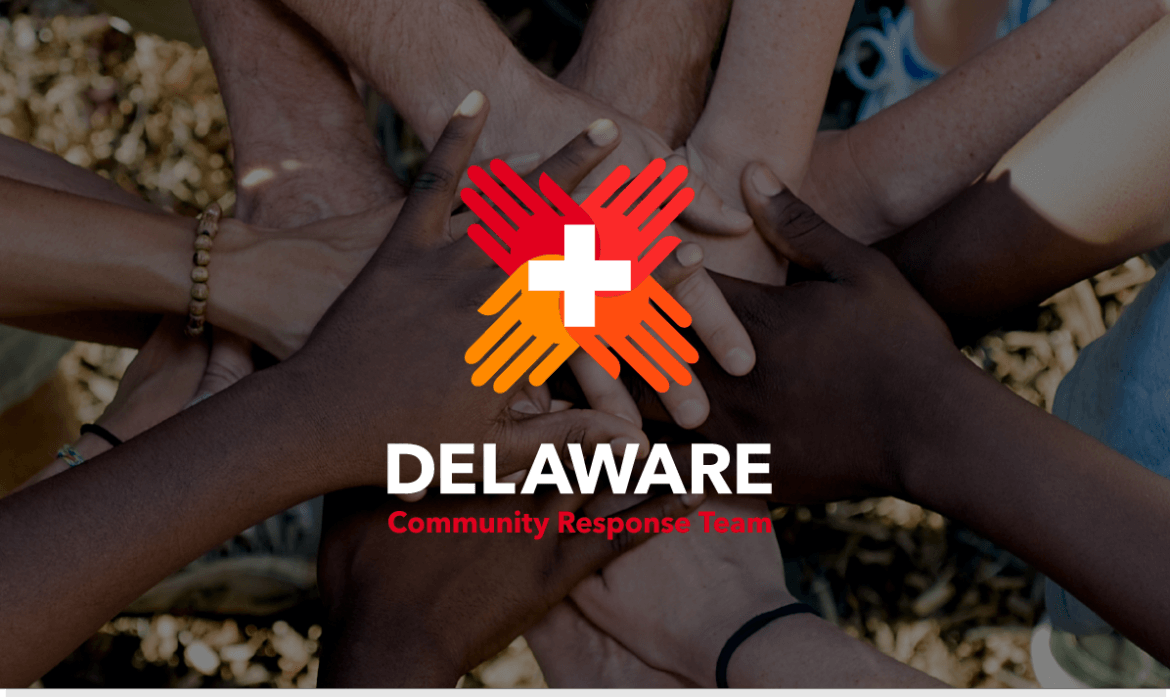
Our designers created a logo that used color to represent diversity, hands to represent unity, and the red cross to represent care. The symbol, at first glance, is seen as all of these, letting the communities they serve identify them as help. The final logo consisted of full and abbreviated versions to allow for the widest variety of usage and ease of identifiability.


