Challenge
Areté Consultants, a top-tier manufacturer of sensing systems used in marine, land, and air, were looking for a branding company when they found Sutter Group looking to rebrand the 40-year-old company. Areté had risen quite dramatically over the past 20 years in the eyes of military buyers of sensing systems. Plus, the company had grown into seven locations with hundreds of employees nationwide. Many of those locations had been working on their own with limited interference from headquarters, so many employees were unaware of projects other than their own.
Because of Areté’s product sophistication, Areté’s new CEO wanted the world to know that Areté had evolved into being a “prime” contractor in addition to its ongoing work as a sub-prime. In fact, primes that are household names even outside the defense community have become subs to Areté from time to time, particularly in production. In addition to carving out a stronger niche in the eyes of the military community, Areté had also begun adapting some products for the commercial world, particularly energy corporations.
Despite Areté’s great growth over the years, Areté executives prided themselves on companywide communication and on being available to staff at all levels. Areté’s executive team wanted Sutter Group to include as many interviews with staff of all kinds (e.g., scientists, engineers, security, IT, new hires, and team leaders) to get as much feedback on company strengths and help ensure all staff were on board with the branding strategy.
In brief, Areté’s executives wanted a brand that played “with the big boys” but also was distinctive and unique. Aretesians, as Areté employees are called, consistently believe that the way they go about their work is unique to Areté in the level of creativity, innovation, and collaboration.
Solution
Branding
The first thing Sutter Group did was to meet with executives, who had already done a great deal of brand wrangling on their own. They’d even created a strategic plan, which was a perfect way for us to begin. What we needed to do was simplify and laser focus it so that it had the most useful information for all employees.
Over four months, we put a fine point on the company’s top concerns:
- Mission
- Vision
- Brand values
- Brand promise
- Brand image
- Value proposition
- Brand positioning
- Brand personality
- Brand voice
- Tagline
Sutter Group studied other top defense contractors and companies in terms of messaging, and created a document to help winnow down the original strategic plan and so create what we called a Brand Blueprint.
We created a set of questions for top executives as well as all employees, as well as collected branding information from defense contractors and other companies in the public eye. We turned this document into the beginnings of the Brand Blueprint, which would house not only brand information but the elements of the upcoming style guide as well.
We then sat down with 45 of the company’s nearly 400 employees for detailed interviews about the company’s current position and where the company is headed. The process took the better part of six weeks and many day-long meetings. We also interviewed the political strategy consultants already working with Areté, as executives were already in the process of meeting with state and national legislators from each of seven states Areté does business in.
We then honed the Brand Blueprint into a concise document that also includes a brief company history as well as product descriptions and a brief “elevator pitch.” Now, all seven locations will be using the same words when it comes to describing the company’s work and culture.
Logo development
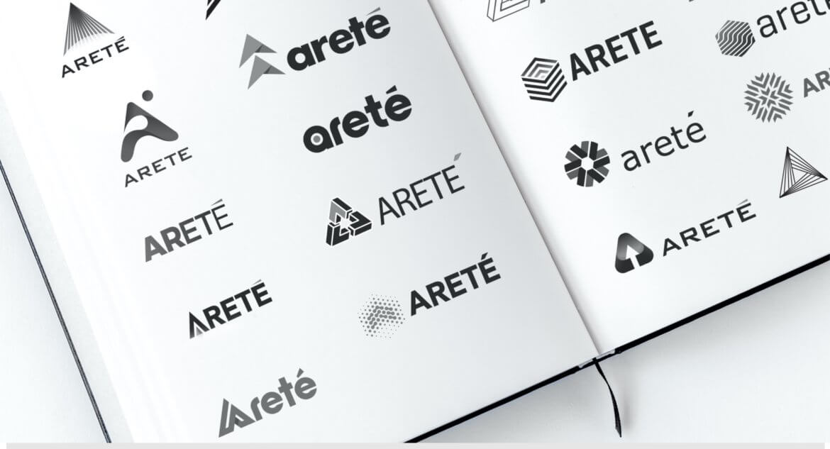
Next, we studied the look and feel of brands in the defense community, including giants Lockheed Martin, Raytheon, and Northrop Grumman — the shapes, colors, and look and feel of logos and other company materials. Most defense contractors chose a royal blue or bright red logo, both considered “power” colors.
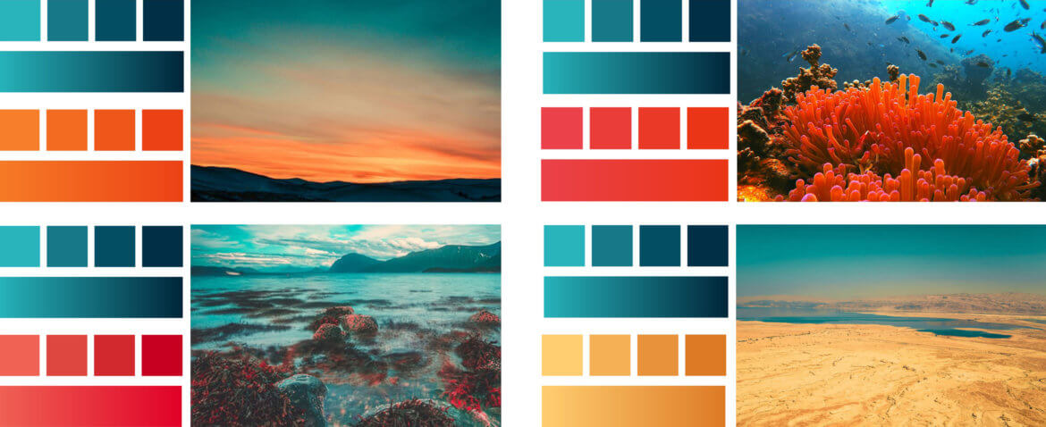
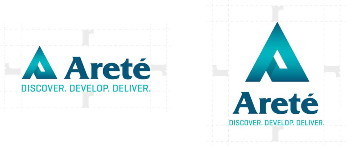
We ultimately suggested an aquamarine, a tip of the hat to Areté’s earliest work in marine environment sensing as well as differentiating Areté clearly from the rest of the pack. The shape of the logo itself was quite a challenge. The early logo had featured waves that represented not only the sea but also the idea of sensing “waves” that are captured via advanced software algorithms. But because the company has evolved from solely creating marine environment sensing systems, we needed to convey the other environments Areté works in — seafloor, undersea, land, aerospace, and space.
We presented five logos to Areté’s executives, and went through 10 iterations before honing the number to three for presentation to the entire company, which we did via several Skype calls, which were paired with video presentation software. Employees voted on the logo of their choice.
To that logo we added a gradated aquamarine and typography (which also went through several iterations) to reach the final. The gradation was particularly popular because it represented the full spectrum of products from seafloor to space.

Rollout
Sutter Group was also asked to help roll out the new look companywide, which we did through three separate presentations, along with a question-and-answer session for each.
This rollout brought Sutter Group into contact with many other employees that weren’t part of the original 45 interviewed.
Letterhead suite
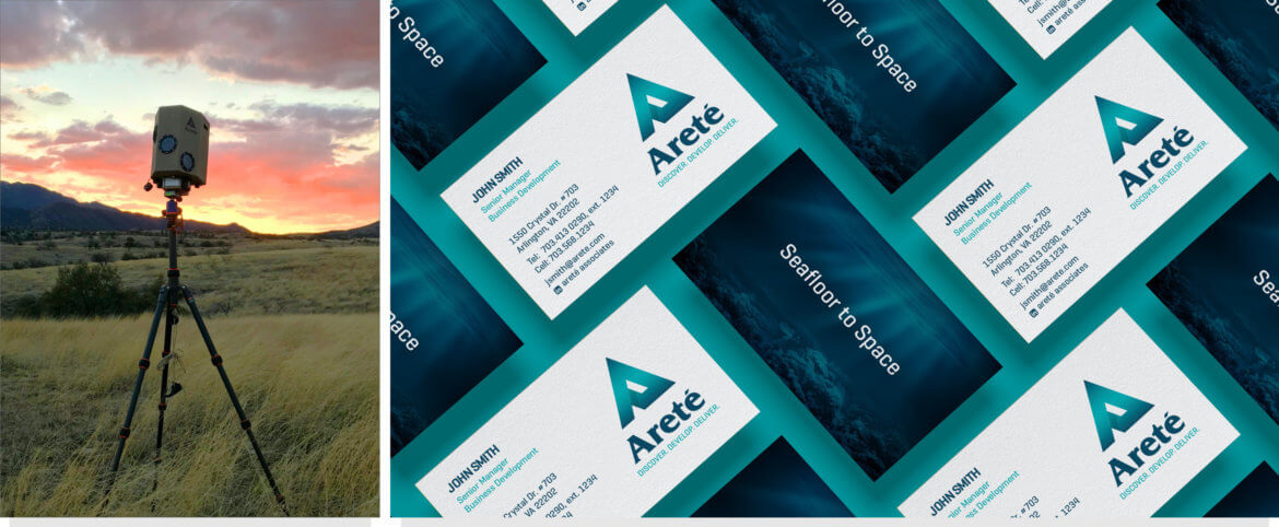
We quickly moved into business card and letterhead production. In the past, each location had created its own business cards, which were different in ink, card stock, logo, and look and feel. The business cards now reflect one headquarters location, even though the phone numbers vary from individual to individual.
Sutter also created templates for a variety of presentations (four basic audiences), so that people creating the presentations can simply drag and drop photos and video as needed.
Merchandise
In an effort to keep interest in the branding high (which it continues to be), management wanted to quickly get merchandise created and distributed.
Sutter created designs for:
- Coffee mugs
- Tee shirts
- Golf shirts
- Jackets
- Ball caps
- Lanyards
- Laser pointers (in the shape of one of their top products)
- And more

Product sales sheets
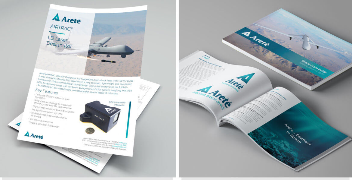
Because business doesn’t stand still even in the face of rebranding, we hit the ground running with conference materials, particularly sales sheets and other presentation materials and leave-behinds. At the time of this writing, we’re still creating more.
Photo, video, and drone shoots
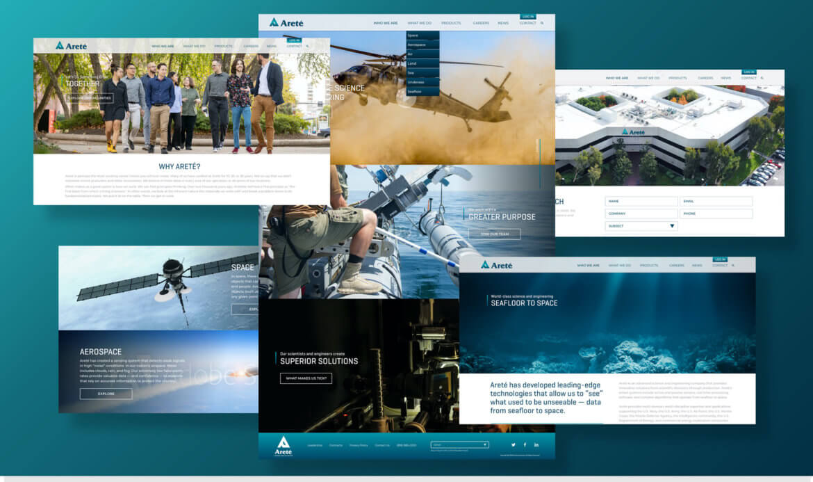
We all felt strongly that the revamped website should be more streamlined and contain many photos, particularly of employees.
Because a major focus of the redesign was to attract new hires, we did shoots that included many of them. We’ve now completed photography at virtually all locations and of all processes and products and nearly all employees.
We’re very proud of these photography sessions!
Web site
We’re currently completing Areté’s website and will post more when we do.


